
When you’re trying to learn more about framing and matting, choosing the right color combination is a critical decision.
The first impression from a framed artwork is primarily based on its color composition. The colors are stored in our memory much longer than the details or proportions of the framing. That is why even if the picture requires a concise, modest framing, it’s still a great decision to work with its color—even a single accent can make your artwork look expressive and memorable.
If you feel overwhelmed by tints, hues, shades, and dominant versus secondary colors, here are some basics to help you through:
- Try bright saturated framing and matting for contrasting art, while dim and modest shades perfectly match images with the dominance of delicate pastel colors.
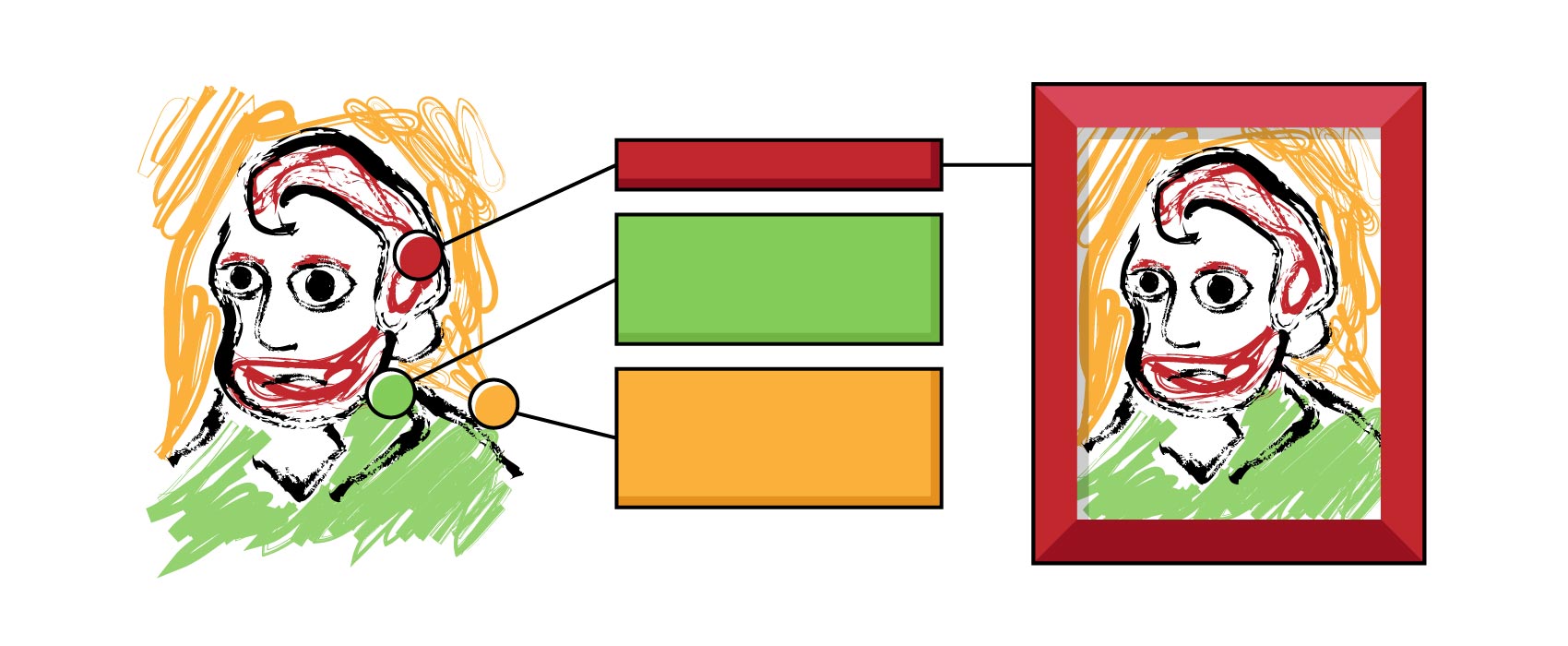
- Artists usually work with a limited number of colors when painting or taking photos. Use one of the dominant image colors, or enhance certain accents on the picture by using a framing of the same shade. This effect is easy to achieve with the digital framing program ImageFramer by using its eyedropper tool. Simply choose any color on the picture and transfer that exact color to the frame or mat of your choice.

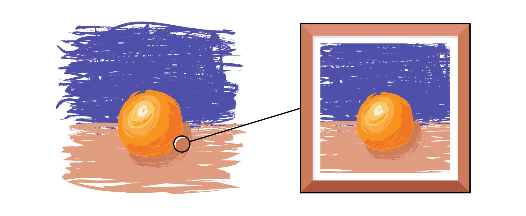
- Usually the brightest accent on the picture emphasizes the main element of an artwork. You don’t want to compete with it. For example, if you frame an image with an orange on it, avoid choosing an orange frame, but consider instead a terracotta color, which will match the shadow of the orange.
- It’s critically important to understand the main subject shown in the picture. Two paintings may contain the same palette of colors, but the main object of the image will lead to completely different framing choices.
- Until recently, colored frames were rarely used. Victorian frames contained velvet panels and other features, but these were small accents on gold or painted wood frames. If your goal is period authenticity, then avoid the colors and follow the style of framing that is typical for an artwork’s intended era. You can explore more about frames from each era in “What’s Your Picture Frame Style? A Look at the History of Framing.”
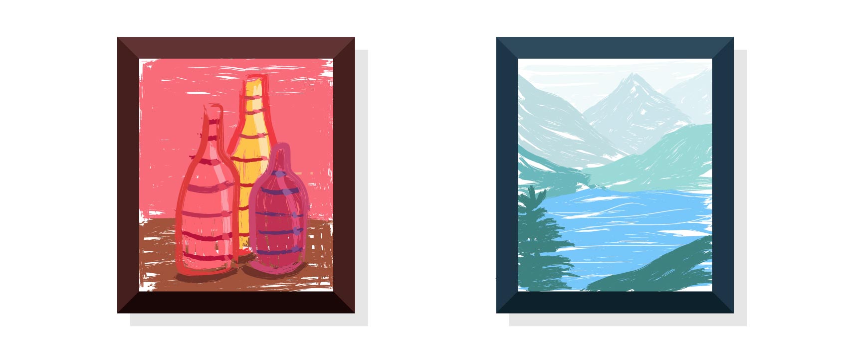
- Coordinate warm and cold colors. A picture with a predominance of red, orange, or yellow colors looks better in a frame of warm shades. Conversely, a picture with blue, purple, or green colors is more suitable for a cold-toned framing.
- The mat can dramatically affect the color scheme and overall look of your art, so don’t forget to use it when framing. Read more on how to choose the perfect shade of mat in “Tips for Choosing the Best Mat Color” and “How to Make Your Artwork Pop With a Digital Mat.”
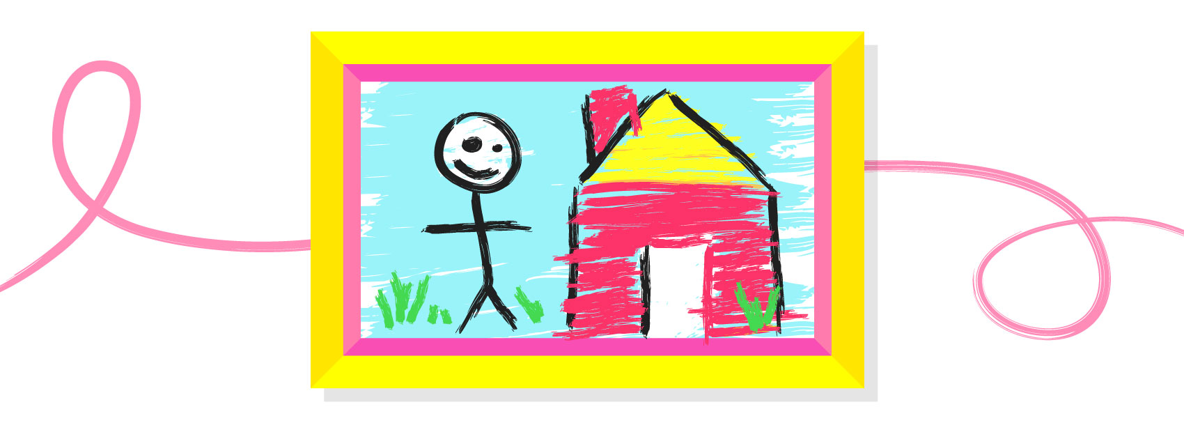
- Pay attention to the mood of the frame and the picture. Some frames seem gloomy and will blend well with cloudy autumn landscapes or a contemplative portrait. At the same time, a cheerful, colorful frame is well suited for framing children’s drawings or family vacation photos.
- If the frame merges with the background of the picture, the central element, where the most important elements of the composition are usually located, will be highlighted and stand out.

When using ImageFramer framing software, selecting the color palette for your artwork becomes an exciting game. You can choose from hundreds of existing shades of frames and mats, or create your own unique color for any frame you like.
ImageFramer 4: Your art. Showcased.
Download the best-in-class Mac app for adding photorealistic frames and mats to photos and artwork today.