Every photograph deserves to be properly presented. An ordinary photo, surrounded by a mat in an elegant frame, creates a totally different perception than the image by itself.
Most people would agree that a frame is an essential enhancement to a classical oil painting, the more elaborate the better. The situation with a photo is slightly different though.
Pro tip: Although a photo also needs a frame, it should be modest and thin, no more than 1 or 2 centimeters wide, and only the addition of a mat can truly enhance the picture!
What is Photo Mat?
A mat can be described as a field of light or color around a picture. It creates a neutral zone between picture and its frame, helping the viewer to focus on the art work itself. Mats can be of different shapes and kinds – rectangular, oval, multilayered, with decorative insertions, etc.
Pro tip: Mat in width usually 1/2 to 1/3 of the image’s narrowest side.
Classical books on photography and composition describe different approaches for finding the optical center of an image:
- More space should be left in the direction of a sight or a movement of the main subject.
- Larger and dark objects are usually located closer to the center of the composition, smaller and lighter – closer to the edge.
- To create volume and balance in the composition, the mat’s lower side is usually slightly wider than the upper edge.
Pro tip: One interesting technique to use is to create an asymmetrical arrangement of photographs within a single frame. This approach can give a further balance to a picture composition. Be careful when experimenting with photo allocation though, as it is very easy to ruin the whole composition with too many unusual elements.
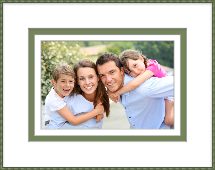
Framed with ImageFramer
Tips for Choosing the Best Mat Color:
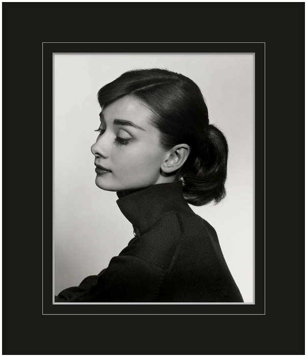
- Shades. The color of a light mat should be a tone darker than the lightest color of the image. If using a dark mat, its color must be one tone lighter than the darkest color on the photo.
- Bright accents. Using a colored mat is a good way to attract attention to important segments of a photograph. In this case, the surrounding color must be the same as the brightest segment of the image, but in more muted tones.
- The simple trick of a double mat will give a personality to an artwork. Two or even three mats of different shades can be applied. The color of the inner mat is usually chosen from a particular tone in the image, which may be lighter or darker than the outside mat.
- Perfect match. It is important to remember that colors and shades of a mat must be chosen to complement the color of the frame and the main color of the picture.
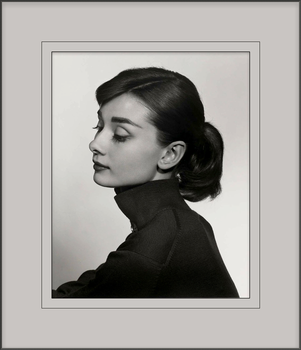
- The most versatile colors are shades of white: café-au-lait, ivory, mouse gray etc. These colors do not distract the viewer’s eye from the photo but help to visually separate the image from its frame and the background.
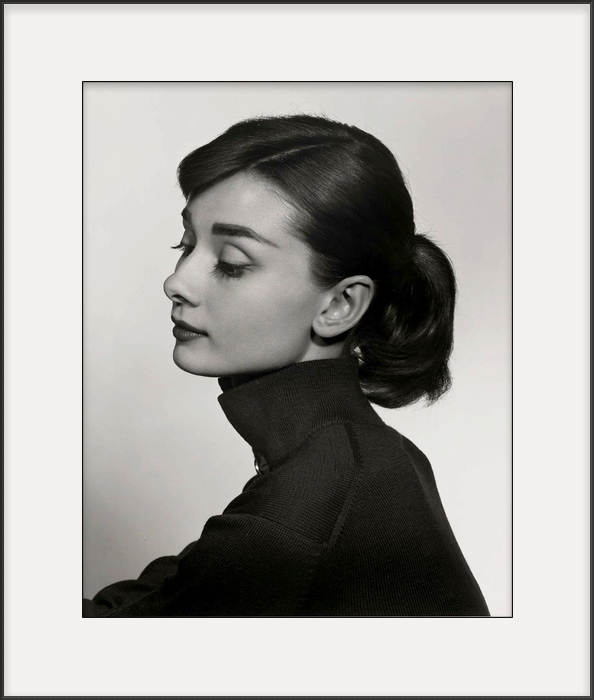
- Tones. Lighter colors add depth to a picture, visually pushing the art work away from the viewer, while a dark mat pushes a photo forward. A mat of a neutral gray color keeps the image flat.
Framed with ImageFramer
Pro tip: There is a popular misconception that the most common color for mats is white, but in fact, bright solid colors should be used very carefully. Instead of helping a viewer, they can become a bright area around a photograph, which distracts attention from the photo itself. This is the reason why pure white mats are rarely used, except for black-and-white photos.
ImageFramer offers a huge selection of mats, as well as frames that play the role of a mat, which is especially good for oil paintings. Besides the usual colors, which accompany photographs and watercolors, you can select the color of your mat, using any color from your photo.
Want to know more? Read How to make your art pop with digital mat >>