A mat can transform an otherwise ordinary piece of artwork, enhancing or even radically changing the impression it makes. To make your favourite digital art stand out, there are several things to pay attention to: Colour, width, layers—and, of course, the frame itself.
Colour changes everything
The colour of the mat you choose can dramatically change how a picture is perceived. Before you start choosing mat colours, study the image and identify the three dominant hues. The primary colour will be the most commonly used; figuring out the secondary and tertiary colours doesn’t have to be scientific, just look for two other colours that stand out.
Pro tip: Can’t figure out which colours make the cut? Look at the image through squinted eyes: This makes it harder to see texture and subtle details, so the main colours will stand out better.
In general, choose a mat based on the secondary or tertiary colours—this will help the eye stay focused on the the image itself. If you use a mat that matches the primary colour, the eye won’t know where to look!
Your mat doesn’t need to be identical to the colours used in the image, however. You can adjust the hue—make it darker (“shade”) or lighten it (“tint”). Here’s the effect this will typically have:
- A darker mat will restrain a picture, creating a kind of tunnel effect that directs the gaze inward.
- A lighter mat will help open an image and make it appear larger.
- Neutral colours, such as shades of white or black, are also a safe choice: They subtly sit in the background so the picture can dominate the space around it. Neutral is also typically the best bet for a single mat.
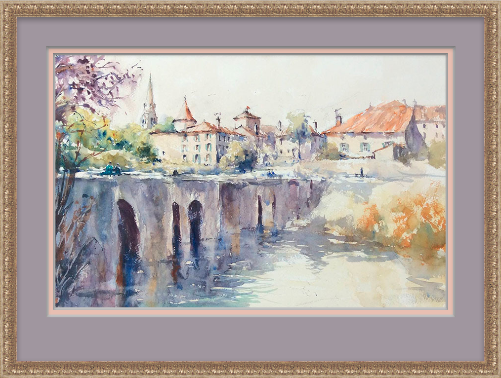
Framed with ImageFramer
Mat Width: Important but tricky
The width of the mat might be one of the most important and difficult considerations for something that can seem like such a small detail. If you make it too wide or too thin, the whole thing could look off balance. Selecting mat width depends primarily on two things:
- The size of the work, and
- The size of the focal point within the image.
When it comes to digital art, size is relative—after all, what are a few pixels here or there? So the size can be as much about the impression you want to make as the actual dimensions of the artwork.
As a rule of thumb, professional framers typically recommend a mat width that’s twice the size of the frame you use.
Pro tip: Matted images often create the illusion that the bottom edge is thinner than the rest when it’s actually the same width. You can offset this by making the bottom edge slightly wider than the others.
It’s worth testing different looks with a picture frame simulator. For example, using a mat that’s wider than the standard can give small pictures a greater sense of significance and drama.
With large paintings in sizeable frames, you can use mat width to maintain balance. “Once mouldings widened to 3″, 4″ or more, mats had to proportionately grow just to maintain a balanced presence, to establish a better relationship between frame, mat and inner artwork,” explained professional framer Chris A. Paschke in an article about proportion.
It can also be helpful to tweak the width of your mat when your image needs some extra help. For example, if a picture is a non-standard size (i.e. too wide or too long) or if the focal point is very close to the lower edge of the image, the mat can be adjusted to compensate.
This same technique can be applied in cases where two pictures of different sizes are shown together: If the inner edges of both mats are made slightly narrower, the two pictures will look more balanced.
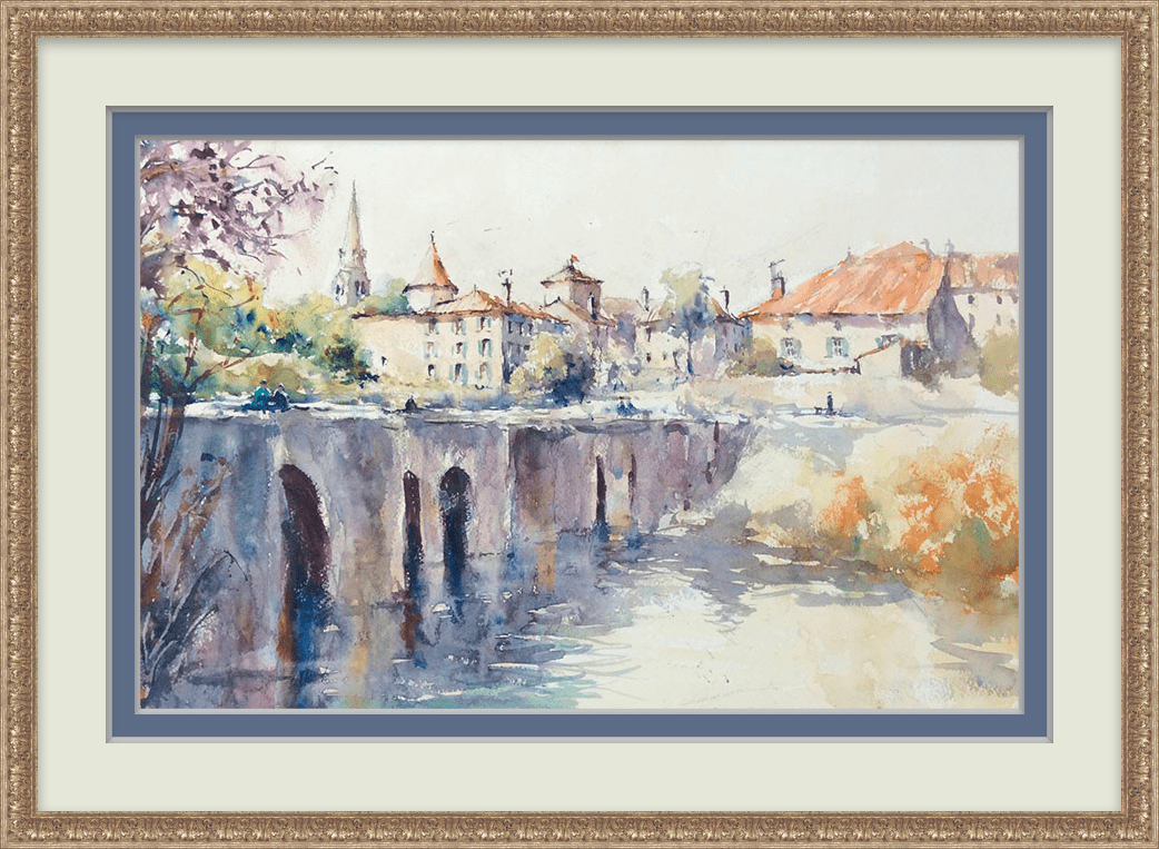
Framed with ImageFramer
Layer mats for extra impact
Using multiple mats—what’s called double or triple matting—can add additional depth and focus to an image. But when you use a double mat, the rules change. Here are a few examples:
- Use a neutral colour for the outer mat. For the inner mat, choose a shade that matches the primary colour of the painting. This “high-contrast” approach helps add volume.
- Black-and-white images can look stunning with a narrow black internal mat with a wide white outer mat.
- A monochromatic approach, where you use mats of the same colour, can very subtly influence perception.
Sizing a double mat also has different guidelines. Avoid giving your mats the same proportions or, worse, making both mats the same width as the frame. The latter creates a striping effect, which can be irritating to look at! To avoid this, make the inner mat—the one closest to the image—more narrow.
Pro tip: Do not overload! On smaller pictures, more than one mat can seem overwhelming. And if the artwork is complex, multiple mats can create a look that can easily overwhelm the viewer.
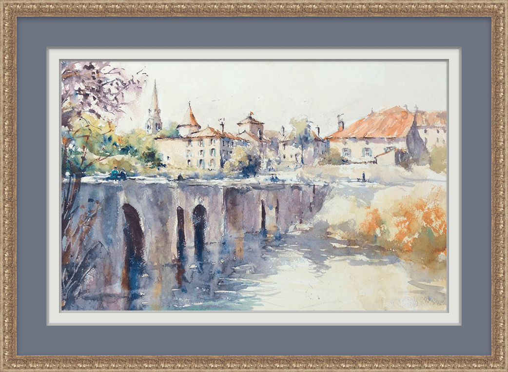
Framed with ImageFramer
Choosing a digital mat has one aim: To make your artwork look great! Experiment with different colours, widths, and layers of matting to see how the look changes and pick the one that looks best to you.
Want to know more tips about matting? Make matting interesting with ImageFramer >>