There are several basic rules and schemes to match colors using the color wheel below.
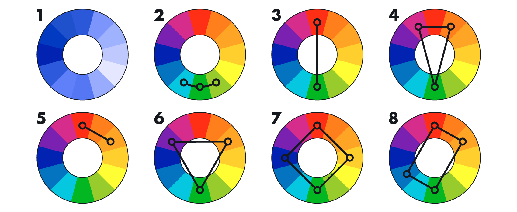
Eight popular color schemes shown on the color wheel
Using a complementary color scheme
Complementary colors are located on opposite sides of the color wheel, as shown on wheel #3 in the diagram above. The combination of such colors looks vibrant and energetic.
The use of contrasting combinations such as these requires special skill and tact from the framer. It is important not to overdo it and to skillfully balance the colors. If the color composition is harmonious but seems too bright to you, there is no need to replace bright colors with muted tones. Instead, you can dilute such a composition by adding achromatic colors—white, gray or black.
We recommend the use of complementary colors in bright and contrasting images as accents. For example, they can be the color of the upper and lower mat, or the colors of the mat and the frame.

In framing this photo, we can use a thin red frame, wide white upper mat and a thin green line as a lower mat.
Using an analog color scheme
For the analog scheme (wheel #2 in the diagram), choose colors located next to each other on the wheel. Such color matching is the best when used in soft compositions. This scheme looks harmonious and pleasant because such combinations are most often found in nature.
Looking at the color wheel, you will see that some harmonious combinations can be soft and calm, like yellow with spring green. Others, like pink and orange, are quite spectacular. Whatever your choice is, the result may be more interesting than if you used shades of only one color.
The color combinations presented in the segments that are located just one swatch apart from one another are also considered to be more harmonious than contrasting (see color wheel #5 in the diagram).
To help your artwork look harmonious when choosing a frame color, focus on the predominant color in the image and choose the color that is closest to it in the color wheel. Then, add a mat of an analog shade if needed.
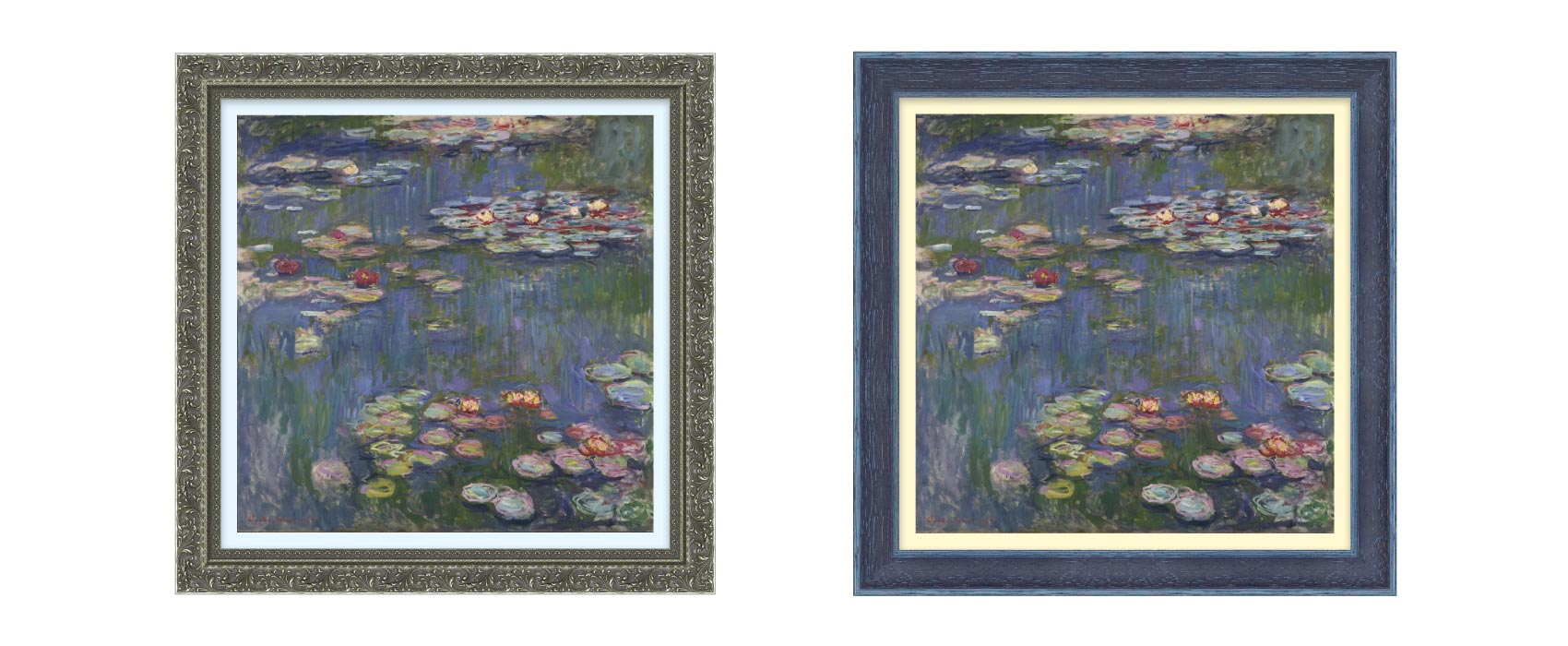
For example, in framing this painting from Claude Monet’s Water Lilies series, we could pair a light blue mat with a green frame or a light yellow mat with a blue frame.
Using a monochromatic color scheme
If, for instance, you chose yellow framing for your artwork, the palette in a monochromatic scheme (wheel #1 in the diagram) can vary from pale yellow to dark orange. A balanced color composition can be created, which may be boring when framing a “yellow” picture, but which can look spectacular if the yellow colors of the image play the role of accents.
Working with split-complementary color schemes
There are four types of split complementary color schemes, as follows:
- Color wheel #4 in the diagram shows the contrast triad color scheme. Compare this to color wheel #6, which shows the classic triad color scheme. The most organic and pleasant, though still contrasting, combinations are created when using these schemes.
- Square and rectangular color schemes are shown on color wheels #7 and #8 respectively.. Using these schemes, choose a single color as the main one and use the others as accents. Despite the largest variety of combinations, these schemes are rarely used in framing, since too colorful picture framing might distract the viewer from the image itself.
The color schemes listed above can help you easily select well-matching colors for your choice of a frame and a mat. If you still doubt whether you have chosen the right color, there are several online color wheels that you can consult, for example, Adobe Color.
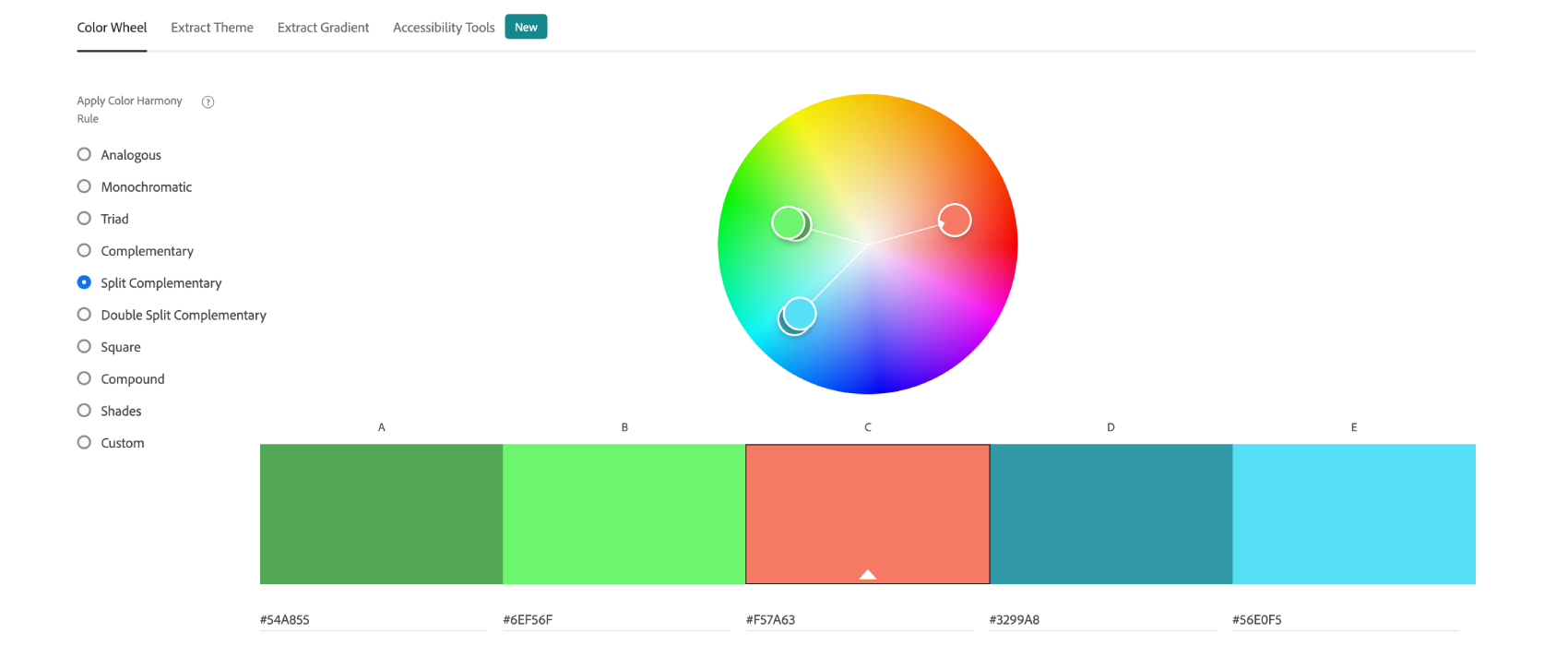
Create color palettes with Adobe Color
Do not forget that the rules are made to be broken. Therefore you can use these recommendations but it is more important to follow your gut feeling. Sometimes the use of incompatible colors may give very unexpected results. This being said, rely on the rules, but do not forget to experiment! Fortunately, ImageFramer allows you to make as many design decisions as you want. Feel free to create several framing options for the same image, compare them and choose exactly what suits you!
ImageFramer 4: Your art. Showcased.
Download the best-in-class Mac app for adding photorealistic frames and mats to photos and artwork today.