Your customers are always looking for great art and great service. What they aren’t short of is options. You need a way to help your art stand out.
How artwork is framed is important to both the buyer and the art itself. A piece of art isn’t complete until it has a frame. Without one, the artwork will struggle to show its full potential—especially when it’s digital, not showcased on a wall but sitting in the middle of a busy web page.
Adding a digital frame doesn’t just add polish to an online presentation; as in a gallery, you can use digital mats and frames to emphasize a piece’s best features.
Select the best frame for the artwork
There are two schools of thought when it comes to framing: Do you match the frame to the art or the decor? Your customer may have their own opinion, but for now, showcase the artwork in a frame that complements it.
- Choose a frame that matches the style of the artwork. With digital frames, you can access a rich library of photo realistic styles, textures, and materials from different periods to find one that fits.
- Select a frame colour that suits the image. Typically, a frame should be a shade lighter than the darkest colour in the picture—but it can be lighter, as long as it’s still darker than the mat.
- Consider the composition. If the image contains strong geometrical lines, keep the frame fairly simple. You don’t want a frame to overwhelm or distract people from the image.
Before making a final choice to share with a customer or upload to your site, try different options and compare the style of the picture frame to those used for other, similar pictures.
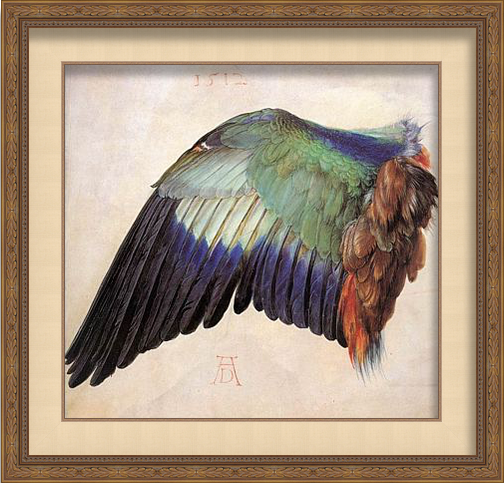
Framed with ImageFramer
Use a digital mat to further enhance artwork
When framing art with a physical frame, mats are practical as well as decorative. When it comes to digital, however, a mats whole purpose is to make a piece of art look fabulous.
Here are a few best practices to keep in mind:
- The standard rule is to use a mat that’s double the width of the frame. There are exceptions like the one noted below, but start with the recommended width and adjust from there.
- If an image contains movement, use a wider mat—especially if the perspective goes beyond the frame or if the subject fills the entire image. Don’t overdo it, though, or the composition will lose its impact.
- Adjust the width of each side if you need to. Perspective can be funny; sometimes an image will look off balance even if each side of the mat is the same width. So you might need to make some adjustments to compensate. If a picture is vertical, the upper edge should generally be wider than the sides; if it’s horizontal, the sides should be wider than the top. For a square image, the bottom edge should be wider while the other three sides should be the same.
- Choose a mat colour that matches hues in the painting but not the dominant one. Using a mat that’s the same hue as the primary colour will make it harder for the eye to figure out what to focus on. Usually, the best colour for a mat is slightly darker than the lightest tone in the picture, but if dark colours predominate in the picture, a darker mat can be chosen. You can read more about How to make your artwork with digital mat here >>
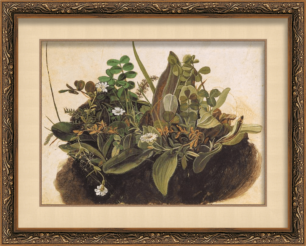
Framed with ImageFramer
Seeing art in person can have a powerful effect. It’s hard to replicate that online, but a great frame and mat can help make a stronger impression—regardless of the setting.
Need help getting started? ImageFramer is the Mac way to frame your artwork. >>