Whether you’re doing a mock-up for a customer who wants one of your fine art photos framed or want to create a polished finish for an online gallery, adding frames to your digital photos is the classic final touch on your hard work.
But how do you frame a photo in a way that complements the composition without overwhelming it? Digital framing has so much more to offer than a boring thin black border. Here are five tips to help you find the perfect frames for your photography.
1. Match the frame and mat style to the photo
When you start looking at framing, it’s important to recognize that the composition of your image will expand to include both the frame and the mat—which can subtly enhance or radically transform the mood your photo evokes.
Look for a mat and frame that match the style of your image, especially if you composed a photo to try to capture a particular look or era. Ideally, any textures should fit the same theme as the photo, or even echo a feature of the composition, such as a distinctive shape.
Simple compositions often look best with simple frames. For example, a thin silver frame can be the perfect complement to a black-and-white photograph. But simple can also be best for more complex images: An abstract photo and a photorealistic ornate gilt frame will be at odds with each other.
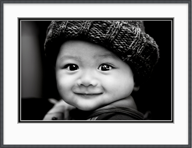
Framed with ImageFramer
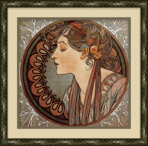
2. Choose complementary colours
Before you pick a mat or frame, identify the most dominant three colours in your photo. The right mat can help your photo pop, you just need to find the right colour.
Generally speaking, avoid choosing a mat that matches your primary colour; the eye won’t know where to focus, which could make your photo confusing to look at. Instead, use a mat in the same hue as a less dominant colour—you can mix things up a bit with a darker shade or lighter tint.
The colour of the frame should complement the image. For photos dominated by cool colours, pick a cool-coloured frame. If the photo is rich with warm colours, pick a similarly warm frame.
Pro tip: Feeling stuck? Natural wood and dark bronze frames look good with almost anything.
Of course, there’s an exception: Black-and-white photos. It’s common to see a black-and-white image with a white mat and black frame, or a similarly contrasting black mat with a white frame.
If you’re facing this situation, remember this rule of thumb: White (or light) can help an image expand, while black (or dark) will typically constrain it. Try both to see which best captures the mood of your photo
 Framed with ImageFramer
3. Keep the width in proportion to the image
The balance between the width of the frame and the size of the picture should always be taken into consideration: The larger the picture, the wider the frame. Since digital deals with pixels rather than inches, you can also use the width of the mat and frame to imply scale.
Going wider than what might be typical can add weight to a photo, especially one that has a more classic feel to it. In contrast, thin and lightweight frames emphasise the elegance of small and average-sized pictures; they help to focus attention on the image by using the frame to create a kind of shadow effect.
Pro tip: Mats are typically sized so the window is slightly smaller than the image itself—no gap. With photography, however, it’s common to make the window slightly larger, so there’s a bit of white space (i.e. quarter- to half-an-inch) before the mat begins. If you opt for this look, make sure your image is centered!

Framed with ImageFramer
4. Consider using multiple frames
Some images use double or triple mats to add depth. But have you considered using multiple frames to add drama to a photo? Digital frames make layering particularly easy.
Stacking frames is an interesting and unusual way to frame a photo. For this technique to be successful, it’s important to choose frames of different widths and textures.
The inner frame, closest to the picture, will play the role of a mat—emphasising both the picture and the beauty of the external frame at the same time.
Framed with ImageFramer
5. Break the rules
This article contains a lot of basic rules of thumb but remember: Trust in your taste and don’t be afraid. Art is about individual choices and —unless you need to meet a particular request from a customer—you know your work and style best. So if you feel the rules need to be broken, don’t hesitate.
Take your time, experiment, and enjoy the process!
Need help getting started? ImageFramer is the Mac way to frame your artwork. >>